


To improve readability, shorten your sentences, use everyday words, and format text for scannability with clear headings and white space. Before you adjust fonts and line lengths, simplify the text itself. Then use metrics like the Flesch-Kincaid Grade Level to validate your work and make sure it matches your audience’s needs.
Contents
- Why Readability Matters More Than Ever in 2026
- The Two Pillars of Readability: Text vs. Visuals
- How to Measure Readability: Demystifying the Formulas
- The 4-Step Content-First Workflow to Instantly Improve Readability
- Form Follows Function: Optimizing Visual Readability for the Scannable Text
- Readability Across Different Disciplines
- Conclusion
- FAQ
Why Readability Matters More Than Ever in 2026
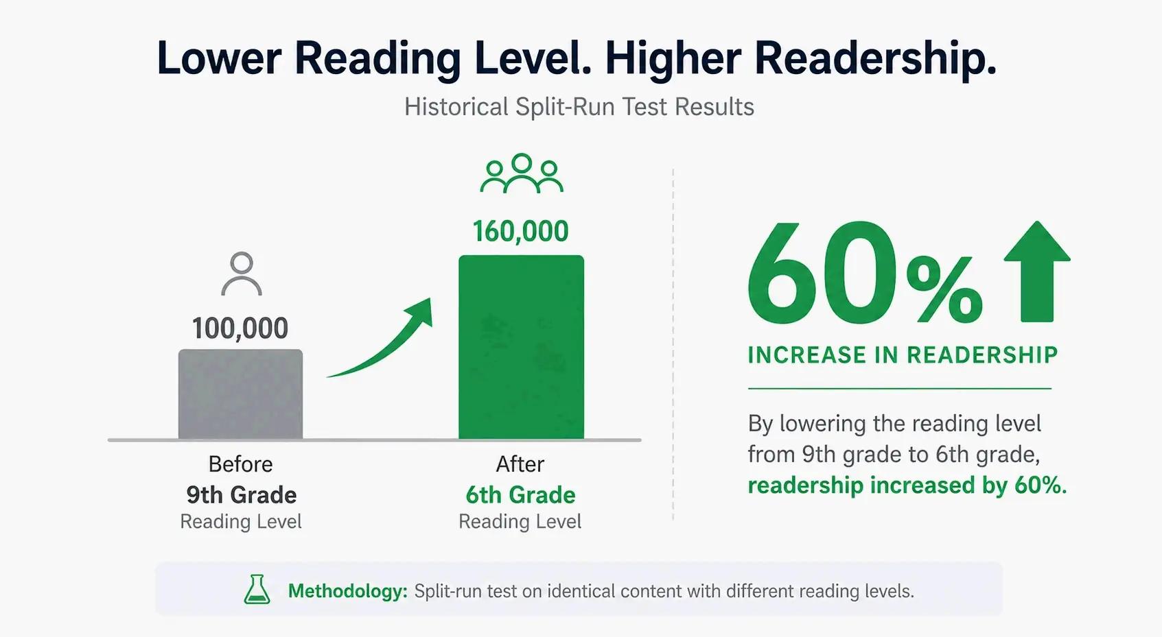
The link between clear writing and reader engagement isn’t new. Back in 1947, Donald Murphy ran a split-run test in Wallace’s Farmer and found that dropping an article’s reading level from 9th to 6th grade boosted readership by up to 60% for one story and 43% for another. The gains were especially strong among readers under 35. That principle is now amplified by modern analytics, where clearer text directly improves SEO metrics like bounce rate, time on page, and scroll depth.
Today’s digital landscape throws another challenge into the mix: AI-generated content. Generative AI can churn out first drafts fast, but it often produces monotonous sentence structures, leans too heavily on the passive voice, and lacks natural rhythm. The result is text that feels flat and is hard to stay with. That makes human-led readability work a key differentiator—both for keeping people engaged and for avoiding AI content detectors that flag generic, predictable patterns.
Most readability advice treats the words and their visual presentation as two separate problems, often tackled in sequence. This guide bridges that gap with a content-first approach. It recognizes that while typography and layout matter, they need to come after the text itself has been simplified and clarified. The goal isn’t just legible content—it’s content that people actually want to read.
The Two Pillars of Readability: Text vs. Visuals
The “Content-First Readability Framework” rests on two pillars: Textual Readability and Visual Readability. Textual readability is about the prose—word choice, sentence structure, and how densely ideas are packed. Visual readability is about the design—typography, line length, white space, and contrast. A frequent mistake is polishing the visual layer while ignoring clunky sentences. That’s why the textual side needs to come first. If a sentence runs 30 words and is loaded with jargon, even the best font won’t rescue it.
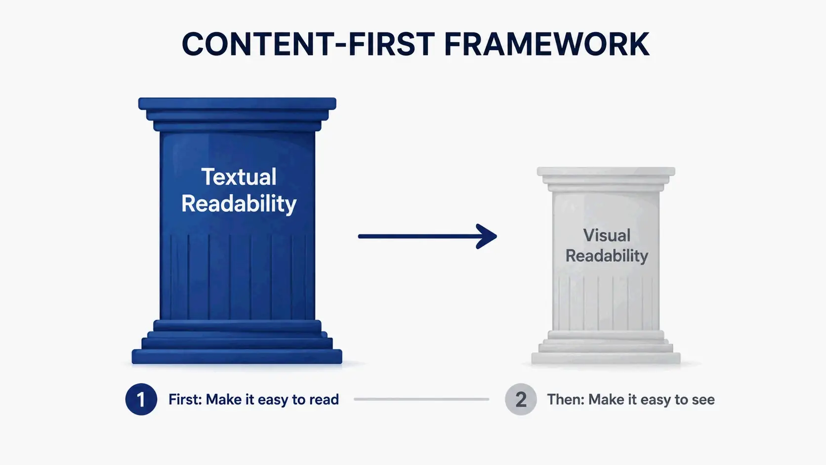
The ultimate goal connects both pillars. As Typographica puts it, “The term readability doesn’t ask simply ‘Can you read it?’ or ‘How fast can you read it?’ It also asks ‘Do you want to read it?'” That’s a powerful benchmark when you audit your own work. After simplifying the text, your visual formatting choices should be intentional—guiding the reader’s eye, cutting down cognitive load, and turning reading from a chore into a smooth experience.
What is Textual Readability?
Textual readability focuses purely on the words you write. Its main levers are sentence length, word complexity, and the balance of active versus passive voice. Improving it means hunting down filler words, swapping jargon for plain language, and breaking long, unwieldy sentences into clear, digestible points.
What is Visual Readability?
Visual readability focuses on how your text looks on the screen or page. Key factors include font choice, characters per line, spacing between lines and paragraphs, and color contrast. Good visual formatting makes content scannable, reduces eye strain, and gives readers a clear hierarchy so they can grasp the structure at a glance.
How to Measure Readability: Demystifying the Formulas
To actually improve readability, you need a way to measure it. Instead of chasing a fuzzy idea, these formulas give you a concrete target. The two most prominent—Flesch-Kincaid and Gunning Fog—quantify the same core problems: sentence length and word difficulty. Once you understand what they’re counting, the score stops being a mysterious judgment and becomes an actionable editing guide.
Deconstructing the Flesch-Kincaid Grade Level
The Flesch-Kincaid Grade Level is a standard used by the US government and many industries, with a typical target of a 7th to 8th-grade reading level. As readability tests from Siteimprove point out, its strength lies in how it directly penalizes the two main cognitive burdens on a reader. The formula is: 0.39 x (total words / total sentences) + 11.8 x (total syllables / total words) - 15.59. It rewards shorter sentences and words with fewer syllables, making it a solid all-around diagnostic for general audiences.
The Gunning Fog Index: A Focus on Jargon Density
The Gunning Fog Index follows a similar logic but gets tougher on jargon density. It also spits out a US grade level, but it specifically counts “complex words”—those with three or more syllables. Siteimprove explains the formula: 0.4 x [ (words / sentences) + 100 x (complex words / words) ]. The key insight is that it doesn’t just look at how long your sentences are; it measures the density of heavy, multisyllabic terms in a passage. A text full of short but unfamiliar jargon words can score worse (a higher grade level) on the Fog Index than on Flesch-Kincaid, revealing a different kind of readability problem.
The 4-Step Content-First Workflow to Instantly Improve Readability
Here’s a concrete, repeatable editing workflow you can run through in about 10 minutes. It moves from a high-level diagnostic to a final, human quality check.
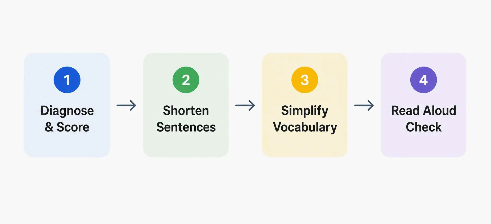
Step 1: Diagnose with a Score. Run your text through a free tool like the Hemingway Editor or a grammar checker such as Grammarly. Get a baseline Flesch-Kincaid grade level. Don’t obsess over a perfect number right away; look for a direction—lower than before. As Quetext advises, a score of 8–9 is the sweet spot for most online content.
Step 2: Attack Sentence Length. Zero in on sentences that exceed 20 words. The average sentence in Elizabethan times was around 50 words; by modern times, it’s shrunk to about 23. Digital content needs to push that trend even further. Take a sentence like: “Due to the fact that the project experienced significant delays, the team, in order to meet the revised deadline, had to utilize additional resources.” That can be broken apart. Switching from passive to active voice is your primary tool here: “The team prepared the report” is always clearer than “The report was prepared by the team.”
Step 3: Hunt and Simplify Complex Words. Use your editing tool’s dictionary or a simple document search to find and replace common filler words and multisyllabic verbs. This step calls for direct action.
Step 3 in Action: A Swatch List for Clearer Word Choices
| Complex Word/Phrase | Simple Alternative |
|---|---|
| Utilize | Use |
| Demonstrate | Show |
| In order to | To |
| Due to the fact that | Because |
| Approximately | About |
| Additional | Extra, More |
| Consequently | So |
Step 4: Read Aloud for Rhythm. This human editing pass catches what algorithms miss—monotonous rhythm and awkward phrasing. It’s exactly where AI-generated text often falls short, creating a flat, robotic cadence. As the Trinka blog notes, a grammar checker “reads your text without the knowledge you carry as the author,” but it can’t judge rhythm. If you stumble while reading aloud or run out of breath, that’s a clear signal to restructure the sentence. This step is what turns technically clear text into genuinely engaging prose and provides a strong E-E-A-T signal of human quality.
Form Follows Function: Optimizing Visual Readability for the Scannable Text
Once your prose is clear, format it for how people actually read online. Users don’t read—they scan. Research from the Nielsen Norman Group confirms that the average user reads only 20–28% of the words on a web page. Your formatting has to guide them straight to that 20% that matters most.
Typography is the foundation. The gold standard for body text is a line length of 50–75 characters, with 66 being the ideal sweet spot—a guideline from typographer Robert Bringhurst cited by UXPin. Lines that stretch too long cause eye strain; lines that are too short break reading rhythm. This ties directly into paragraph structure. Stick to a strict “one idea per paragraph” rule, creating plenty of white space that reduces cognitive load and makes the content feel less like a wall of text.
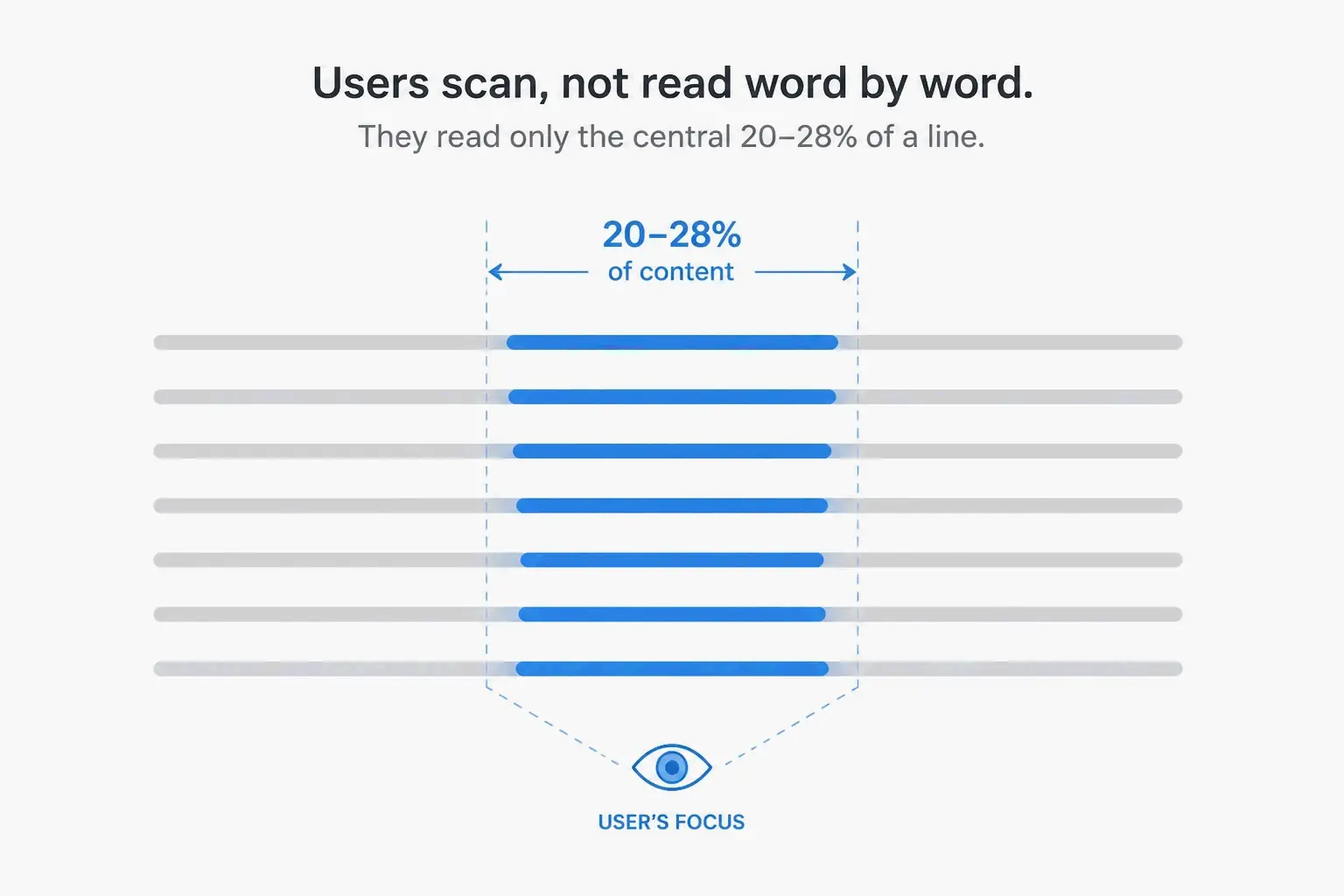
Finally, boost scannability by building a clear, visible skeleton for your content. Use descriptive H2s and H3s, bulleted lists for parallel points, and strategic bold text to highlight key takeaways. Someone skimming should be able to absorb the page’s main argument in seconds just by reading these elements. That’s not dumbing down your content—it’s respecting your reader’s time and attention.
Readability Across Different Disciplines
The core principles are universal, but their application looks different from field to field. In UI/UX and web design, following the Web Content Accessibility Guidelines (WCAG) is essential. WCAG Success Criterion 1.4.8, for example, recommends a maximum of 80 characters per line for non-CJK languages to allow proper text spacing and prevent horizontal scrolling when users zoom in.
For code readability, the focus shifts from machine requirements to human communication. A popular Stackoverflow answer explains it simply: use “variables [that] are named meaningfully, so that they communicate intent,” and make sure “standards of indentation and formatting are followed, so that the code and its structure are clearly visible.” The aim is to make a program’s logic easy to follow, prioritizing clear naming conventions over explanatory comments.
In healthcare, the stakes are higher and the measurement tools are different. The SMOG (Simple Measure of Gobbledygook) Index is a readability metric often recommended for this sector. Unlike formulas that mainly assess sentence length, the SMOG formula—as defined by Siteimprove—focuses heavily on the number of polysyllabic words in a sample of at least 30 sentences. That makes it a stringent test of medical jargon density.
Conclusion
Improving readability isn’t a one-time action; it’s a mindset that puts the reader’s time and cognitive load first. Start with a foundation of clear, concise writing, then support it with formatting that’s easy to scan. The real test of success isn’t a number from a formula—it’s whether your audience wants to read your content and can understand it without effort. Apply the four-step editing workflow to your next piece: get a baseline Flesch-Kincaid score, zero in on the longest sentences, hunt down complex words, and do a final read-aloud pass. Track how that affects engagement over time, and you’ll see a direct return on your investment in clarity.
FAQ
What reading grade level should I aim for in my writing?
For most general audiences in the US, aim for a 7th to 9th-grade level. That aligns with the average adult reading level and matches the style of popular publications like Reader’s Digest. It’s worth noting that people often choose to read for pleasure at a level two grades below their actual reading ability.
Does improving readability help with SEO?
Indirectly, yes—and significantly. Highly readable content keeps users on the page longer, lowers bounce rates, and encourages deeper scrolling. Those engagement signals are known ranking factors for search engines. Clearer text is also easier for crawlers to parse for topic relevance and is more likely to earn backlinks as a trusted resource.
Can I use AI or grammar checkers to automatically fix my readability score?
They’re powerful for diagnosis and a first editing pass, but you can’t rely on them completely. Tools like Grammarly can flag long sentences and passive voice, but they often miss issues of rhythm, context, and stylistic nuance. AI content platforms that handle the full publishing workflow, like GeoWriter’s keyword-to-publish pipeline, can bake readability checks into every stage of content production. Still, always finish with a human “read aloud” pass to make sure the text isn’t just simple, but genuinely engaging.
What is the difference between readability and legibility?
Legibility is a subset of readability and refers purely to visual clarity. It asks whether you can easily tell an “i” from an “l” based on the font. Readability is the broader concept that includes legibility but goes further. It asks whether the arrangement and flow of the words, sentences, and layout make you want to read and, ultimately, understand the text.
