


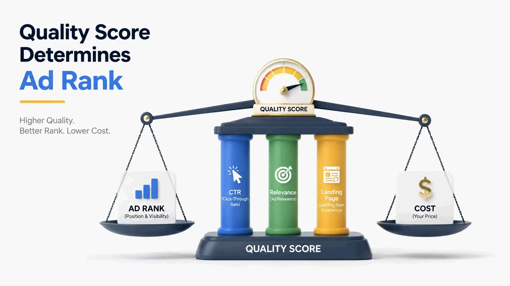
Quality Score comes from three ratings—Expected Click-Through Rate, Ad Relevance, and Landing Page Experience—each marked as “Below Average,” “Average,” or “Above Average.” Ad Rank is then calculated by multiplying your Quality Score by your max CPC bid, plus the expected boost from ad extensions. That determines your ad’s position and real cost per click.
Contents
- What Is Ad Rank? The Formula That Decides If Your Ad Shows
- How Is Quality Score Calculated? The Three Components and Their Hidden Math
- The Direct Financial Impact: What Your Quality Score Costs You in Real CPC Dollars
- The Quality Score Triage Framework: Which Keywords to Fix First
- How to Systematically Improve Quality Score and Ad Rank: A Component-by-Component Playbook
- Quick-Fix Optimization Playbooks: E-Commerce vs. Local Services
- Google Ads vs. Microsoft Advertising: Key Differences in How Quality Score Is Calculated
- Conclusion
- FAQ
What Is Ad Rank? The Formula That Decides If Your Ad Shows
Ad Rank doesn’t just set your ad’s position on the search results page. It’s the gatekeeper that decides if your ad shows up at all. During every Google Ads auction, the system calculates an Ad Rank for each eligible advertiser. Only those that meet a minimum threshold get to display their ads. At its heart, the formula balances what you’re willing to pay with how relevant your ad experience is.
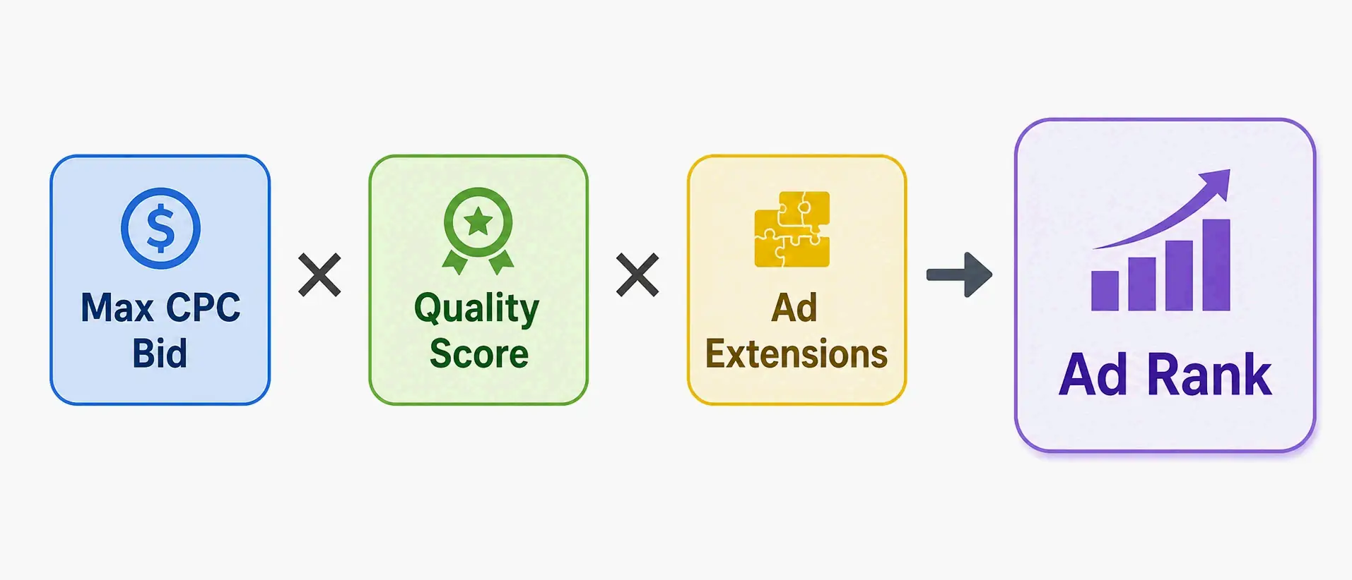
The basic math is: Ad Rank = Max CPC Bid × Quality Score + Ad Extensions Impact. So, a competitor with a lower bid can still beat you if their Quality Score and the expected impact of their ad extensions are much better. On the flip side, a sky-high bid can’t always make up for a lousy user experience. Ad Rank is how relevance gets wired straight into the auction’s economics.
The Complete Ad Rank Formula, Explained Component by Component
The Ad Rank formula pulls together three inputs. Get these right, and you gain a real edge. Each one affects whether your ad is eligible to show—and where it lands.
Max CPC Bid is the most you’re willing to pay for a click. You set it, but it’s only one piece of the auction puzzle. The actual cost per click you end up paying is usually lower—it’s determined by the Ad Rank of the advertiser just below you.
Quality Score is a 1-to-10 diagnostic, calculated per keyword. It’s Google’s way of rating how relevant and useful your ads, keywords, and landing pages are for someone’s search. As AdSights notes, the simplified formula is Ad Rank = max bid × Quality Score (plus thresholds, ad asset impact, and contextual signals). Think of it as a multiplier on your bid—it makes your ads more or less competitive without touching your budget.
Ad Extensions Impact tosses a third variable into the mix. When your ad is displayed, Google estimates how much extensions like sitelinks, callouts, and structured snippets could improve performance. That estimate is added straight onto your Ad Rank. That’s why using every relevant extension can give you a steady ranking boost and more visibility—no need to raise your bid.
Real-Time Auctions vs. Your Keyword-Level Quality Score: Why Your CPC Still Fluctuates at QS 7
Here’s a common head-scratcher: Your Quality Score sits steady at 7 or 8, but your actual CPC and ad position still bounce around. That’s because each auction’s Ad Rank calculation relies on real-time signals that are completely separate from the 1-10 diagnostic score you see in your dashboard.
Your keyword-level Quality Score is a rear-view mirror—it reflects aggregated performance from past auctions. But during a live auction, Google looks at contextual signals: the user’s device, location, time of day, the exact search query. These factors can shift your effective Ad Rank and CPC, even while your reported Quality Score stays put. Microsoft’s Help docs point out that their quality score is based on historical data and isn’t used in real-time auctions—a helpful contrast to Google’s more opaque approach.
How Is Quality Score Calculated? The Three Components and Their Hidden Math
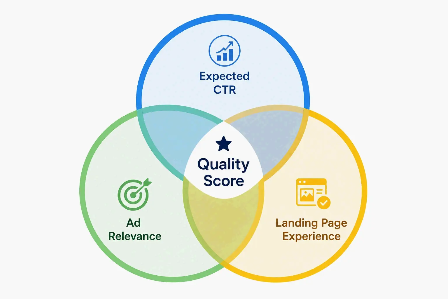
Quality Score isn’t one big rating. It’s a composite built from three sub-scores, each measuring a different stage of the user’s journey—from what they type into the search box to what happens after they click. Knowing what each one evaluates is the first step to improving them systematically.
Expected Click-Through Rate (CTR) predicts how likely it is that someone will click your ad for a given keyword. It’s based on your historical CTR, adjusted for things like ad position, and then Google compares your predicted performance against other advertisers chasing the same traffic. This isn’t just a report card of past clicks—it’s a forward-looking guess at how appealing your ad looks compared to everyone else’s.
Ad Relevance measures how well your ad copy lines up with what the user actually wants. Think of it as semantic alignment. Someone searching for “emergency plumber” is in a hurry. An ad that says “professional plumbing services” creates a relevance gap—it doesn’t address that urgent, specific need. This component slaps down broad, generic messaging that fails to speak the user’s exact language.
Landing Page Experience judges whether your website is useful, relevant, and easy to navigate for someone who just clicked your ad. Google looks at page load speed, mobile-friendliness, how relevant the content is, and transparency. A slow page that doesn’t deliver on the ad’s promise gets a low rating. AdSights reports that one e-commerce account shaved its mobile LCP from 4.8 to 2.1 seconds—and their Quality Score jumped from 6 to 9 in two weeks.
The Hidden Math Behind the 1-10 Score: Why It’s Not a Simple Average
You can’t just average the three component ratings to get your 1-10 Quality Score. Google uses a weighted, normalized formula—and keeps the exact weights under wraps. Your final score comes from stacking your performance against a normalized benchmark set by other advertisers bidding on that exact keyword.
That competitive normalization is a big hidden factor. Your score can shift even if your own numbers haven’t budged—just because a rival improved their ad relevance or sped up their landing page. The 1-10 figure shows where you stand in a competitive landscape, not some absolute measure of quality. That’s why you should treat Quality Score as a diagnostic that flags friction points in the customer journey, not as a KPI to chase for its own sake.
How Each Component Rating (“Average,” “Above Average”) Actually Weighs In
Each of the three sub-scores gets a label: “Below Average,” “Average,” or “Above Average.” These labels are your diagnostic breadcrumbs. But they don’t all carry the same weight. Expected CTR is tilted heavily because it’s a strong predictor of whether an ad is relevant to someone’s immediate need.
As a rule of thumb, all three at “Above Average” typically gets you a 7 or higher. A mix of “Average” and “Above Average” lands you around a 6. One “Below Average”—especially on Expected CTR or Ad Relevance—drags you down to 5 or lower, even if the other two are perfect. That’s why pinpointing the weak link beats generic optimization every time.
The Direct Financial Impact: What Your Quality Score Costs You in Real CPC Dollars
A higher Quality Score acts like an automatic discount on your cost-per-click. The link between your score and what you pay is hard-wired into Google’s auction pricing. According to WordStream, a Quality Score of 10 can cut your CPC by 50% compared to the baseline. A score of 1? It can inflate it by a jaw-dropping 400%. That spread means every single point up is a direct boost to your margins—especially on competitive commercial keywords.
Here’s a real-world gut punch. AdSights documented a SaaS advertiser who pushed the Quality Score on their top-spending keyword from 4 to 8. The actual CPC dropped from $12.00 to $6.40. They didn’t just slash bids—they tightened their ad group structure and sharpened relevance. That mechanically lowered the price they paid for the same traffic.
CPC Multipliers by Quality Score Tier: The Actual Math
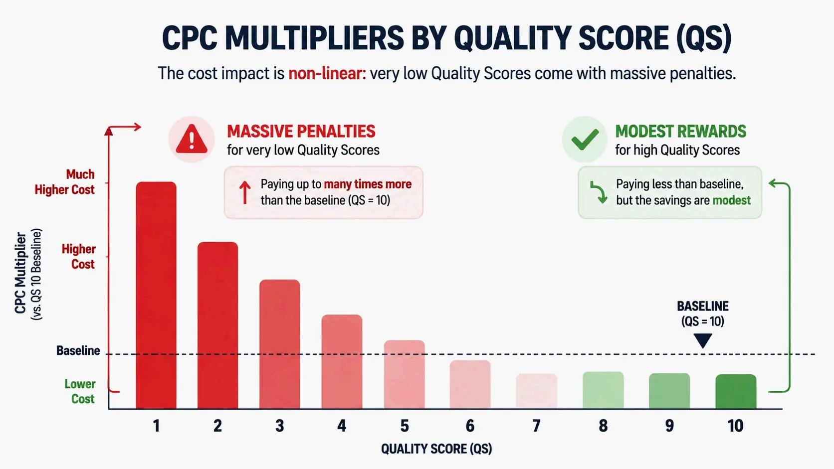
The cost multipliers for each Quality Score tier aren’t linear—they spiral dramatically at the low end. Here’s the full table from WordStream’s analysis, showing the financial penalty for poor relevance and the payoff for strong alignment.
| Quality Score | CPC Impact (vs. Baseline) |
|---|---|
| 10 | -50% |
| 9 | -44% |
| 8 | -37% |
| 7 | -28% |
| 6 | -14% |
| 5 | Baseline |
| 4 | +25% |
| 3 | +67% |
| 2 | +150% |
| 1 | +400% |
A keyword with a Quality Score of 1 costs you five times the baseline CPC. If your baseline is $2.50, you’re paying $12.50 per click, versus just $1.25 at a score of 10. Over a campaign getting 5,000 clicks a month, that annualized overspend can drain an entire marketing budget fast.
The Non-Linear Savings Curve: Why Fixing a QS of 2 Is an Emergency
Your number one priority? Fix keywords sitting at a Quality Score of 1, 2, or 3. The math makes this a financial emergency. Going from a 4 (25% penalty) down to a 1 (400% penalty) more than triples your cost. The absolute dollar savings from moving a keyword from 2 to 4 dwarf the savings from pushing a keyword from 8 to 10—the latter might only shave a few percentage points off an already-low CPC.
This non-linear curve dictates how you triage. The low-hanging fruit isn’t in polishing high scores to perfection—it’s in rescuing the disaster cases. Go after keywords with scores of 1-4 first, the ones actively bleeding budget. That’s where you’ll capture the biggest marginal return, plugging the financial leak before you chase incremental gains on healthier keywords.
The Quality Score Triage Framework: Which Keywords to Fix First
A plain list of low-QS keywords isn’t a smart to-do list. If you optimize without prioritizing, you’ll waste time on keywords that barely move the needle. A disciplined triage framework uses spend data as the main filter, so you zero in on fixes that actually shift the bottom line—not just make a cosmetic metric look better.
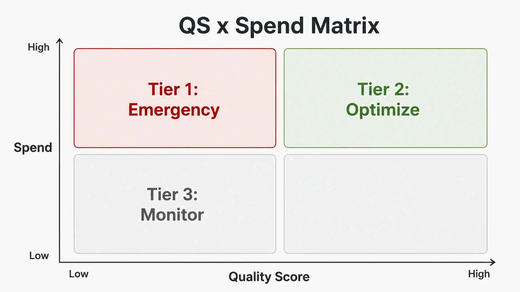
The most effective move: build a QS × Spend matrix. This mental model sorts your keywords by Quality Score and cost, showing four distinct action tiers. Just export your keyword data, sort by cost high to low, then filter by Quality Score thresholds to assign a priority to each one. This instantly pulls the few true emergencies out of a sea of non-urgent noise.
The QS × Spend Matrix: Define Your Tier 1, Tier 2, and Tier 3 Fixes
The triage framework groups keywords into three tiers, based on the financial damage they’re doing. That way, your limited optimization resources always go where they’ll hit hardest.
Tier 1: Emergency Fixes. High-spend keywords with a Quality Score below 5. These are financially dangerous—they chew through budget with massive CPC surcharges. Fix them, often by restructuring ad groups or aligning landing pages, and you’ll see an immediate, outsized return. That SaaS advertiser case from AdSights, where a high-spend keyword at QS 4 was the first target, is a textbook Tier 1 that drove a major CPC drop.
Tier 2: Optimization Targets. High-spend keywords at QS 6 or 7. They’re competitive but still leaky. The goal is to nudge them from “Average” to “Above Average” by sharpening ad copy relevance or speeding up the page. Because of the high click volume, even small improvements unlock serious absolute savings.
Tier 3: Monitor or Remove. Low-spend keywords with stubbornly low Quality Scores. If a keyword only gets a few dozen impressions a month, a low QS isn’t a budget crisis—but it is a warning flare. It might mean that search term isn’t a good fit. Consider either a dedicated, tightly-themed ad group, or (more likely) pausing it or adding it as a negative keyword to stop future waste.
Reading Impression Share Lost to Rank as Your Diagnostic Signal
One of the most overlooked competitive metrics in Google Ads is Impression Share Lost to Rank. This column tells you exactly how often your ads didn’t show because your Ad Rank was too low. It’s a direct signal that a low Quality Score is actively choking off your visibility.
When a high-spend keyword shows a high percentage of Impression Share Lost to Rank, it exposes an invisible opportunity cost. You’re not just overpaying for the clicks you get—you’re missing out on impressions altogether. This bumps the keyword’s priority up the list. It confirms that the way to capture more qualified traffic isn’t to jack up your bid, but to fix the relevance and experience issues that are dragging down your Quality Score and, in turn, your Ad Rank.
How to Systematically Improve Quality Score and Ad Rank: A Component-by-Component Playbook
A better Ad Rank and lower CPC don’t come from one vague fix. You need a component-by-component playbook. Find out which of the three Quality Score sub-scores is “Below Average,” then apply the specific fix for that metric. Improving Landing Page Experience won’t fix a problem caused by lousy Expected CTR.
This targeted approach stops you from spinning your wheels with random tweaks. By hitting the weakest link for each keyword, you move scores efficiently. The three playbooks below tackle each component head-on, with a sequence of concrete actions and clear success criteria.
Fix Your Expected CTR: Ad Copy Architecture for Higher Click Rates
A low Expected CTR rating means your ad isn’t earning the click from your target audience. The fix is a disciplined approach to ad copy that mirrors both the language and the emotional intent behind the search.
Step one: tighten your headlines to mirror the search queries in that ad group. If the keyword is “visitor tracking software for B2B teams,” your headline needs that same specificity—not a generic “Best Software Solutions.” Step two: state a clear value outcome in the description. Tell them what they’ll get, not just what your product is. Step three: include a direct call to action that signals the next step.
A key part of managing expected CTR: pause underperforming ad variations ruthlessly. Ads with a history of low CTRs drag down the signal for every keyword in that ad group. Regularly A/B test two or three headline variations per ad group—that’s the only way to surface and scale the messaging that really clicks.
Fix Your Landing Page Experience: The Technical and Content Checklist That Actually Moves Scores
A “Below Average” Landing Page Experience rating is common but serious—often because landing pages live outside the Google Ads dashboard and are owned by a different team. Unbounce analyzed over 64,000 landing pages and found that 44% had more than one conversion goal, 78% had navigation menus that leaked visitors off the page, and 55% lacked social proof above the fold.
To bump this rating up, start with technical parity. Use PageSpeed Insights and get your mobile Largest Contentful Paint (LCP) under 2.5 seconds. Compress images below 200KB and dump render-blocking scripts. Next, enforce a strict message match: put the exact headline from your ad into the H1 of your landing page. The promise you made in the ad should be visible instantly, with no scrolling required.
Finally, cut friction and build trust: use one clear, above-the-fold call-to-action. Strip out any navigation menu or competing CTA. Add a social proof element—a customer review or trust badge—so visitors feel they’re in a credible place. These technical and content fixes together speak directly to the Core Web Vitals and user experience signals Google cares about.
The Ad Extensions Multiplier: Don’t Leave This Part of the Formula Blank
Ad extensions aren’t just cosmetic extras—they’re a standalone, additive piece of the Ad Rank formula. Google weighs both the presence and the expected performance of your extensions. Ignoring this part of the formula is like leaving a ranking multiplier on the table.
The most straightforward move: implement every extension that applies. Use sitelinks to route people to specific pages, callouts to spotlight your unique selling points in short bullets, and structured snippets to describe your product or service categories. For e-commerce, price extensions and promotion extensions are critical. Keeping them fresh matters as much as setting them up—updated, relevant extension content often gets a stronger performance lift.
Quick-Fix Optimization Playbooks: E-Commerce vs. Local Services
How you apply Quality Score fixes depends heavily on your business model. A one-size-fits-all approach ignores the structural realities of how an online store versus a local service business actually works. Each vertical has its own predictable failure points—and its own set of tailored fixes.
E‑commerce accounts usually trip up on Ad Relevance and Landing Page Experience because of sprawling product catalogs. Local service accounts have the opposite headache: their ads and landing pages aren’t specific enough to the area or the urgency of the request. The playbooks below lay out high-impact actions for each model.
E-Commerce Optimization Canvas: Fixes That Lift Quality Score Fast
The single most powerful structural fix for e‑commerce: tighten your product intent clusters. Organize keywords into ad groups around specific product types, use cases, and search-intent stages. A common mistake is sending all paid traffic to a generic homepage or a broad category page—that kills both Ad Relevance and Landing Page Experience.
Instead, point each ad group to the most specific product or collection page you have. An ad for “women’s waterproof hiking boots” should land on a page featuring exactly those boots. Then, optimize that product page to close the sale: price, shipping clarity, reviews, and a single “Add to Cart” button all belong above the fold. A slow-loading product page—like the case where reducing LCP lifted QS from 6 to 9—is a deal-breaker for both users and Google’s algorithm.
Local Services Optimization Canvas: What to Fix and Why It Works
Local service businesses face a different core issue: their ads often fail to prove they’re a relevant and urgent fix for a specific area. Start by writing ad copy that puts the city or service area name right in the headline. A search for “emergency plumber Marysville Ohio” demands an ad that answers that exact need—not a generic message about plumbing.
The landing page then has to deliver on that geo-specific promise. It needs location-specific elements: a click-to-call phone button, a service-area map, and localized trust signals like licenses, certifications, or community reviews. A common, critical mistake: sending paid traffic to a generic homepage that tries to serve every town and every service at once. A dedicated landing page that lines up with the ad’s promise gives you the clear message match and trustworthiness that Google’s Landing Page Experience evaluation looks for.
Google Ads vs. Microsoft Advertising: Key Differences in How Quality Score Is Calculated
Google Ads and Microsoft Advertising both lean on the same three-legged stool: Expected CTR, Ad Relevance, and Landing Page Experience. But the data sources, real-time usage, and diagnostic tools differ quite a bit. If you’re running campaigns on both, don’t assume a good score on one will automatically carry over without some adjustments.
One key operational difference: Microsoft Advertising calculates Quality Score using only exact-match search traffic from the past 30 days. Google pulls from a broader pool, factoring in close variants and a wider set of signals. Microsoft’s tighter methodology can spotlight specific keyword-level problems that might get smoothed over in Google’s aggregated models.
More fundamentally, the platforms diverge on how the score is used. Microsoft’s Help docs spell it out: “Quality score is an evaluation of your ads, keywords, and landing pages based on historical performance in past auctions. It is not used at auction time to determine ad rank.” Google also labels its Quality Score a diagnostic metric, but the real-time quality signals that drive auction-time Ad Rank are closely tied to the components behind the score. That makes its practical role in Google Ads a lot more nuanced.
When Microsoft’s Exact-Match-Only Data Tells You Something Google Doesn’t
Microsoft’s exclusive focus on exact-match data gives you a sharp diagnostic edge. By filtering out the noise from broad and phrase match queries, a low score there is a laser-focused signal that a specific keyword has a relevance problem. It works as a cleaner diagnostic tool for your keyword list’s core relevance, helping you spot which exact terms are underperforming without the data getting smoothed over by other match types.
Microsoft also offers a unique diagnostic column called Quality Impact. It forecasts the extra daily impressions you could gain by fixing a keyword’s low-quality score—an estimate Google doesn’t provide. Use this metric in your Microsoft keyword reports, and you’ll have a data-driven forecast to prioritize the terms that will pay back the most in visibility for your optimization effort.
Conclusion
Quality Score and Ad Rank follow a predictable formula, but the real leverage comes from acting on the hidden diagnostics they give you. A low score isn’t a bad grade to dread—it’s a signal pointing to a specific friction point, whether in ad appeal, message match, or post-click trust. Spot that, and you can prioritize high-impact fixes that mechanically push your CPC down. The real opportunity is applying systematic triage to every keyword.
The path forward begins with your own data. Export your keyword report now, sort by cost highest to lowest, and filter for a Quality Score below 6. Use the triage framework from this guide to flag your Tier 1 optimization targets: the high-spend, low-score keywords that are actively hemorrhaging budget. Tackling those before your next budget cycle is the single most effective move you can make to boost account efficiency.
FAQ
Are quality score and ad rank calculated in real time?
Ad Rank gets recalculated for every single auction using real-time signals like device, location, and search context. Your visible Quality Score (1-10), however, is not real-time—it’s a historical diagnostic based on aggregated past performance for that keyword. That’s why your CPC can bounce around even when your QS looks steady.
Is Quality Score the only factor that determines Ad Rank?
No. Ad Rank = Max CPC bid × Quality Score + ad extensions impact. A competitor with a lower QS can still outrank you if their bid is high enough. But a higher QS lowers the bid you need—so you wind up paying less per click.
If my Quality Score is 10/10, should I stop optimizing?
No. A 10/10 means you’re doing well on that keyword, but you can still boost conversion rates, landing page speed, and how you use ad extensions. A QS of 10 doesn’t lock in the top spot—bids and extensions still count. And if competitors up their game, your relative standing can slip.
Does Microsoft Advertising calculate Quality Score the same way as Google Ads?
The structure looks the same—both use Expected CTR, Ad Relevance, and Landing Page Experience. But Microsoft calculates QS using only exact-match search traffic, and they state clearly that QS isn’t used in real-time auctions, just as a diagnostic. Microsoft also gives you a ‘Quality Impact’ metric you won’t find in Google Ads.
How much do ad extensions actually impact Ad Rank?
Ad extensions are a standalone piece of the Ad Rank formula. They can be the difference between a top spot and the second page. Google evaluates both the presence and expected performance of your extensions. Using every extension that fits and keeping them updated gives you a steady ranking boost.
